WeMountain
Client Project

Role: UX/UI Designer
Duration: 3 week sprint
Tools used: Figma, Figjam
Team: 3
The Problem
Following our initial meeting, our clients identified three key areas for site improvement:
Enhancing conversion rates of customers from free introductory courses to paid online courses.
Aligning the content of the free introductory course more closely with customer expectations.
Expanding and strengthening connections within the snow sport community.
The solution
User interviews: 11
Design iterations: 6 (3 in each fidelity)
Usability tests: 12
Enhance the enrolment experience by building transparency, credibility, and confidence through a Courses Page highlighting unique selling points (USPs), including reviews, industry approvals, and partnerships.
Provide a clear understanding of course value by showcasing detailed course information, syllabus, and outcomes, ensuring the user knows what to expect.
Incorporate a quiz for users to test their knowledge about ski safety, reinforcing the course's credibility and value.

The Client
WeMountain, is an online education platform catering to skiers and snowboarders keen on enhancing their knowledge of snow sport safety. Their aims are to enhance the freedom and safety of off-piste ski enthusiasts by prioritizing avalanche risk prevention and education.
Doesn’t everyone love things that are free?
- Nope, but why?
Site Audit
To start, we dove into the free introduction course, experiencing the user journey firsthand via a thorough site audit. By getting hands-on with the platform, we uncovered key insights and formed initial assumptions. These insights helped shape the questions we used during our user interviews.
Current Flow
Current Flow

Our target audience for interviews and usability testing were those who were experienced with off-piste skiing and those who had taken any online courses in the past.
We were able to develop a journey map based on the sentiments and comments users had at each point throughout usability testing on the current site.
Users had difficulty finding the free course
Users were frustrated with having to sign up to the intro course
Users recognised that the free intro course was a list of USPs to join the paid course.
CONCLUSION
Even when something is offered for free, individuals still expect value and a glimpse of what they'll get if they opt for the paid service. If users feel like their time has been wasted, they're likely to be discouraged from using the service further.
Expectations Vs Reality
User research
We conducted 11 interviews with a mix of seasoned off piste skiers and those that have done online courses in the past.
Goals:
Understand main detractors.
Identify users needs when purchasing courses online.
Understand what motivates users to convert from free trials to purchase.
EXPECTATIONS: Research Assumptions
From our initial research we were able to assume that users seek clarity on the value of outdoor-specific online courses through detailed syllabus breakdowns and the ability to contact for inquiries, while also considering reviews and previews of the course platform. Additionally, there's an expectation that joining WeMountain grants access to a supportive community.
learning
We quickly realised that our interview questions weren't hitting the mark for everyone involved. It turned out that we had assumed all participants were new to We Mountain, but those familiar with off-piste skiing had already used the platform. So, we regrouped as a team and developed a new set of questions specifically for these experienced users. It was a valuable lesson in the importance of refining our screener survey questions.
Reality: Results
To understand more we conducted our interviews. The goal was to gain deeper insight into user requirements for online course booking, including understanding key deterrents, user needs, and conversion motivators from free trials to purchases. As a result we were able to see three trends building:
[1] Credibility
I want to know that professionals in the field approve of the online course.
I need reassurance that the online course is credible before making my decision.
[2] Transparency
I want to see a breakdown of the course syllabus before I commit.
I don't proceed with enrolling in an online course if the process or the learning content is not clear.
[3] Value
I seek a vibrant online learning experience and valuable insights, fostering a sense of shared experience and accountability.
I am seeking a methods to balance the enjoyment of my learning experience while also approaching it with a serious and dedicated mindset.
CONCLUSION:
Transparency and value were elements we had already taken into account in our assumptions. However, an unforeseen trend that surfaced highlighted the significance of showcasing the credibility of online courses. These insights allowed us to paint a clearer portrait of the user persona.
Meet Sophie

Goals
Wants to be a responsible skier.
Be part of an lively learning environment
Get credible education
Frustrations
Lack of course content and structure
Feels unsure when a course is not credible
Frustrated when courses are not engaging
Hesitates when learning process is unclear
behaviours
Does her research before commiting to a course
Looks at reviews
Likes the convenience to pace online learning
I want to lead and help my sports companions
I don’t want to make mistakes or take unnecessary risks
Competitively driven
In summary,
Sophie's aspiration to bolster her skills in avalanche safety and her preference for engaging online learning experiences highlight the significance of providing transparent course information and industry approval. To ensure Sophie feels confident in enrolling, it's essential to prioritize transparency and credibility in our offerings. By delivering clear insights into course content and demonstrating industry validation, we can empower Sophie to make informed decisions and pursue her snow sports ambitions with certainty.
Vote, Focus, Thrive: Streamlining the problem
It became super clear to us that the scope was becoming large and we needed to really drill down what our core problem was to be able to come up with some great solutions.
As a team we timeboxed ourselves to come up with several problem statements and went through a strict voting process to drill down our favourites. We were able to join some similar statements together to produce:
Problem statement:
Sophie wants a clear overview of the online course and industry approval because she needs to feel reassured that she will get value from paying for an online course.
… & so how might we:
Provide a way to give transparency and credibility of an online course, so that Sophie feels confident to enrol.
DESIGN. TEST. DESIGN. TEST. DESIGN. TEST.

We collaborated with the WeMountain team in a design studio session to brainstorm innovative solutions. My role involved organizing the workshop structure and creating the Figjam board. After presenting our initial findings and engaging in some warm-up sketches, we embarked on ideation together. It was a rewarding experience for our team as we effectively communicated our ideas to individuals without a design background, prioritising clarity by avoiding technical jargon. Through preparation and mindful communication, we successfully developed three design solutions:
A course page inspired by e-commerce websites.
Pages featuring endorsements from experts.
A quiz to assess user knowledge.

How our solution solves the problem
[mid-fi]
-

[1] Course Overview page
Objective: To influence Sophie towards choosing a course.
Solution: Sophie can now see course objectives, reviews and industry approval.
-

[2] Course Page
Objective: To give Sophie a clear understanding of the course value
Solution: Sophie can clearly see the course details, syllabus and course outcomes.
-

[3] Quiz Page
Objective: To reinforce the course credibility and value.
Solution: A quiz so that Sophie tests her own knowledge about ski safety.
iterations

99 problems and the user flow was one
Usability tests
Goal:
A/B Test two user flows on two groups of participants.
Understand any issues with the user flow.
Understand how easy the website is to use.
Task:
User to select the Offpiste Online Course and complete the quiz.
Results:
All users completed the task within the metrics assigned.
SUS scores showed us the preferred flow is flow 1 (see below), however key iterations were needed to improve the user experience on flow 1.
ch-ch-changes!
[Round 1]
-

[1] user flow
Users testing Flow 2 were confused as to why a modal window pop-up with a Quiz was appearing at this stage in the journey.
Solution: Reduce disruption in the journey by proceeding with User Flow 1.
-

[2] Course Page
Users gave feedback that they would expect further information on the course page.
Solution: Iterated the course page to include “Meet Your Instructor”and a video of the “Online Learning Experience”.
-

[3] Quiz Button
Users felt that the quiz button did not stand out enough.
Solution: We conducted a quiz round of “Crazy 4’s” to come up with a solution. As a result we changed the width, added artwork and adjusted CTA language to appeal to the competitive nature of our users.
[Round 2]
-

[1] Course Overview Page
Users wanted more “at a glance” information and so we added a short snippet including recognisable icons.
-

[2] Course Overview page
Users wanted content on who the courses are created for.
final product
“Great engaging Quiz animation!”
“Everything makes sense”
Results from usability testing showed a significant increase in our System Usability Scale score. This was coupled with encouraging reactions from test users.
client feedback
We received positive feedback from our client, who valued our solution's alignment with their technical capabilities. They were impressed by our approach of repurposing existing content on their site, reorganizing it to enhance the user journey. Stay tuned for the launch of our updates to the Wemountain site later this year!
My Work
-
![]()
Prose and Poetry
-
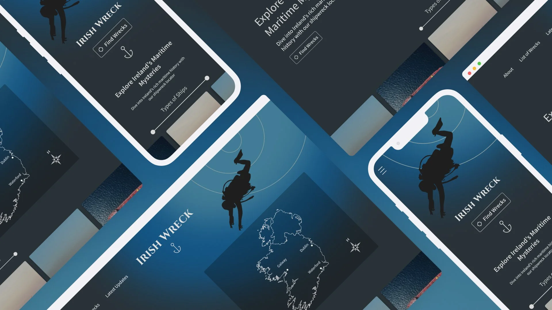
![]()
Irish Wreck