Irish Wrecks

Duration: 4 days
Role: UI Designer
Tools used: Figma, Figjam
Solo Project
I embarked on a mission to transform Irish Wrecks Online into a captivating hub for recreational divers and history enthusiasts alike. The goal was to revitalize the brand identity and enhance functionality to provide an unparalleled experience of Ireland's shipwreck treasures.
First impressions
Usability Huersitics
I first analysed the Irish Wrecks Online website and conducted a usability heuristics of the site. The aim was to identify design problems in the user interface evaluated against a set of guidelines that make systems easy to use.

-
Does the design clearly communicate its state?
Is feedback presented quickly after user actions?
Issues:
Map of Ireland is not clearly interactive unless the user was to read the instructions.
Opportunities:
Create visible signals to show the map to be interactive.
-
Will users be familiar with the terminology used in the design?
Do the design’s controls follow real-world conventions?
Issues:
Buttons on the site say the word “Press” which indicates action users should take but can be mistaken for users to assume these buttons will take them to news articles.
Opportunity:
Use language that users will recognise on call to action buttons.
-
Does the design allow users to go back a step in the process?
Are exit links easily discoverable?
Can users easily cancel an action?
Issues:
When user moves through pages there is no acknowledgement to know where the user has come from.
Opportunities:
Add breadcrumbs on pages.
Ensure there is always a clear way to go back to the homepage.
-
Does the design follow industry conventions?
Are visual treatments used consistently throughout the design?
Issues:
No consistency in colours and sizes on page elements
Opportunities:
Clarify the Design system.
-
Does the design keep important information visible, so that users do not have to memorise it?
Does the design offer help in-context?
Issues:
Going back to the homepage is unclear and users have to be observant to know to click the logo in order to go back.
Opportunities:
Make sure the logo of the website stands out so users can easily go back to the homepage.
-
Is the visual design and content focused on the essentials?
Have all distracting, unnecessary elements been removed?
Issues:
The amount of colours used on the website is distracting for the user.
Opportunities:
Reduce the colour palette intentionally in order to focus the design to optimise user flow.
Devil is in the details
Competitors
Being unfamiliar with the world of shipwreck diving, I analysed other shipwreck locator sites. Drawing from my experience with previous projects, I approached this research with the expectation of finding inspiration for the impending redesign. A quick competitor matrix allowed me to position Irish Wrecks within its competitive sphere. Yet, I soon realised that this conventional analysis wouldn't suffice, as most shipwreck locator websites were found in the same quadrant.

However, this left me with lots of opportunity to explore Irish wrecks as becoming more highbrow, functional and fun. This shift in perspective encouraged me to explore innovative avenues, paving the way for a redesign that went beyond the limitations of conventional analysis. It was at this point I realised all these websites shared a common thread — an abundance of meticulously detailed data. With this insight I was able to understand the heart of these sites:
Passion.
What are you really?
Explorers
•
Tradition
•
Arcane
•
Explorers • Tradition • Arcane •
Brand Personality
I wanted this website to be representative of who these fascinating divers really are. So I explored every essence of the brand tone: What would it sound like? What would it look like? What would it act like?
These divers embody the spirit of true explorers, steeped in rich traditions. They exude confidence, adventure, and boldness. In selecting keywords, I was drawn to the term "Arcane" to encapsulate the inherent mystery in the act of diving.
These powerful words guided my research into the theme, color palette, and overall feel of my design. I divided my research into key elements:
Theme and Mood Exploration
-
![]()
Location
My investigation delved into the cinematography of "Banshees of Inisherin" and the breathtaking coastlines of Ireland.
-
![]()
Colour
I extracted key colors to inform my palette. I also explored hues from the depths of the ocean to infuse the mysterious essence of diving into the design.
-
![]()
Shapes
Drawing inspiration from nautical navigation tools and maps, I examined shapes found in objects and geographical features. I focused on incorporating both sharp and curved edges into my design, mirroring the shapes prevalent in these references.
-
![]()
Typography
I sought to explore various typefaces that seamlessly blend modern and traditional aesthetics. Drawing inspiration from Celtic fonts, I aimed to create a harmonious pairing with clean, modern typography reminiscent of nautical navigation.


Keep it simple
During ideation, my goal was to keep the core functionality in mind. I assessed elements for retention or simplification. I iterated on designs to ensure a clear and straightforward user journey.


Style Guide


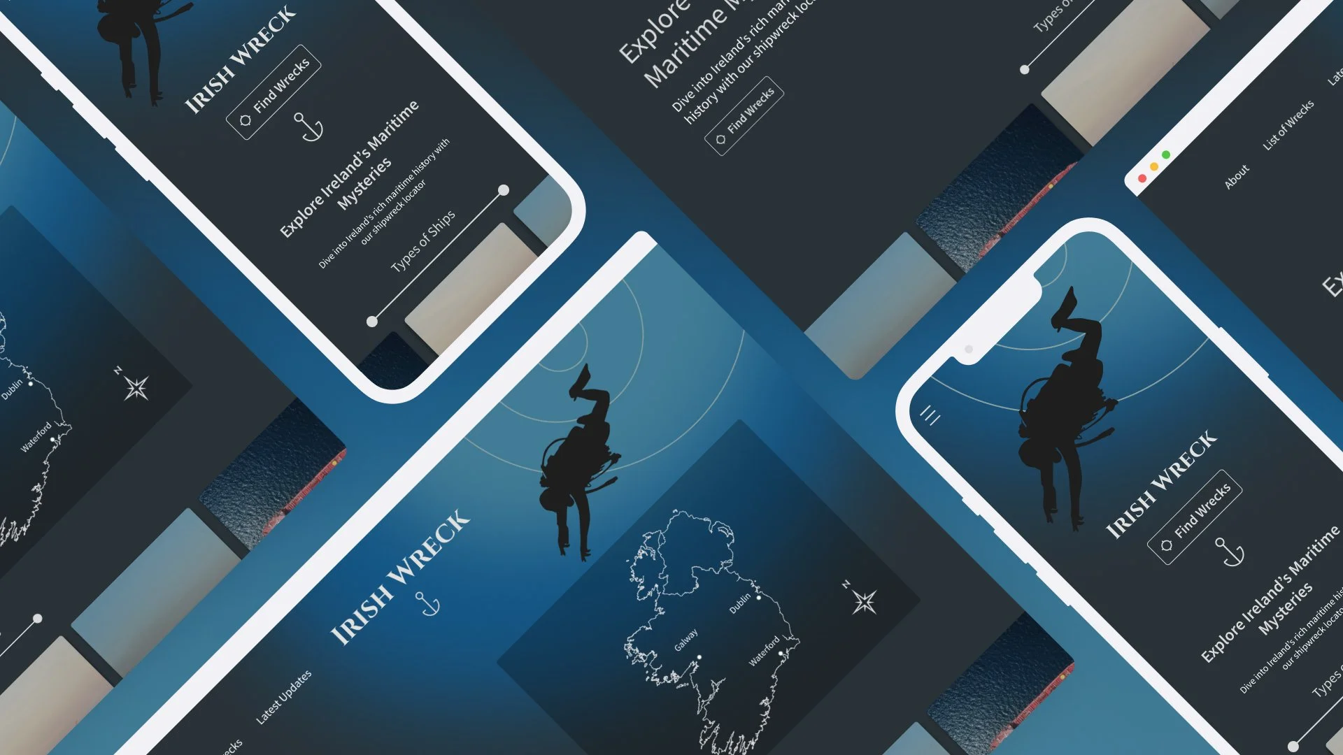
Final product
Check out the final results!
Final
Thoughts
As I embarked on the journey to redesign Irish Wrecks, I delved into a world brimming with passion, discovery, and innovation. What initially seemed like a niche project soon unfolded into a profound exploration of the underlying human spirit. This experience underscored the importance of delving beyond surface impressions and acknowledging what motivates both creators and users.
Through extensive research and careful design considerations, I honed my ability to infuse brand personality and thematic elements into every facet of the UI. From typography to color palettes to shapes, each decision was made with the aim of authentically capturing the essence of the diving community and their thirst for exploration. Additionally, conducting usability heuristics analyses and refining designs emphasised the importance of simplicity in crafting impactful digital experiences.
In essence, this project stands as a testament to the transformative power of design. It has provided me with invaluable lessons and insights that will continue to shape my approach to future projects.
My Work
-
![]()
WeMountain
-
![]()
Prose and Poetry

